Thirty Circles, Thirty Different Ideas
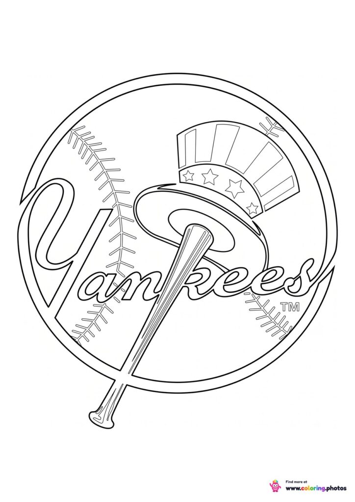
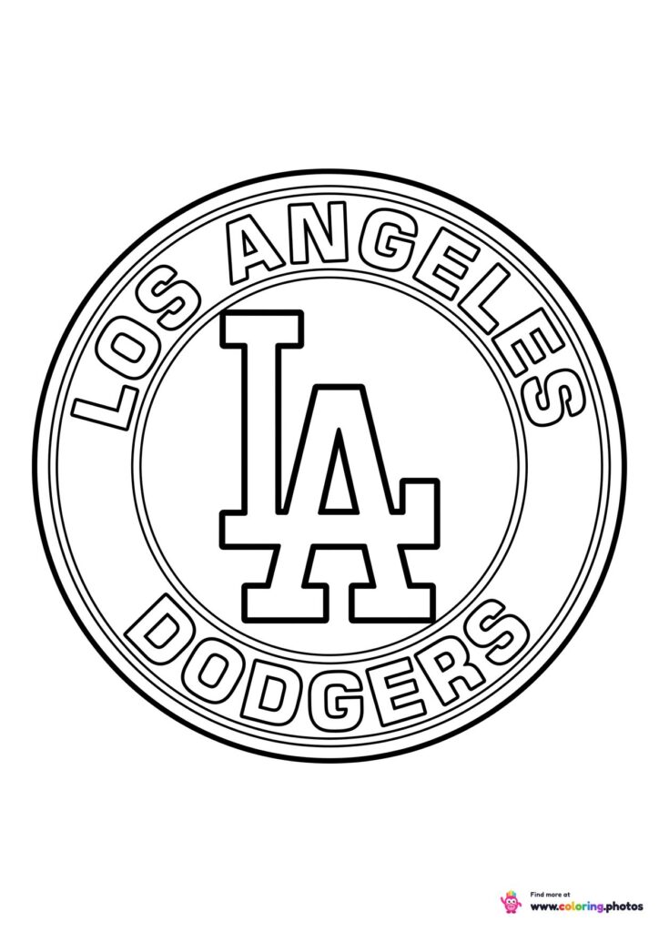
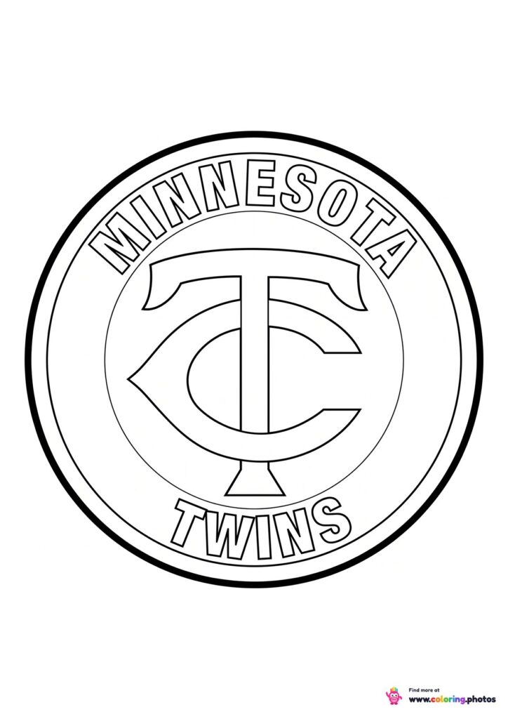
Nearly every crest in baseball starts from the same shape, a ring with lettering around it, and then does something completely different inside. One club puts a liberty bell in the middle, another a compass rose, another a cartoon player caught mid stride. Coloring several in a row turns into a tour of how far you can push one basic layout.
Letters Doing the Heavy Lifting
Baseball leans on monograms more than any other sport. Interlocked initials, an old English capital, a script that loops back on itself. Those letterforms are the whole design on many of these pages, which makes them a surprisingly good exercise in staying inside a curved line. Kids who like clean, graphic results tend to prefer these to the busier animal crests.
Color It Right or Make It Yours
Fans usually want the real colors, and getting them right is half the satisfaction. Everyone else can treat a crest as a blank badge and invent a scheme, which works just as well since the line art carries the design on its own. Printing a few and lining them up finished makes a decent wall of the league either way.





 Sofia the First
 Among Us
 Fortnite
 Minecraft
 Pokemon
 Roblox